
Today’s tools for designing visuals for presentations such as MS PowerPoint allow us to create sophisticated pages with color, animation, charts, photographs, sound, video, and perfectly set type.
When you use visual effects, your presentations become more compelling, interesting and exciting. Visual effects helps you cover more material in less time, and retention and understanding more.
Remember that the number one priority with designing visuals for presentations is legibility.

Proper and creative use of the MS PowerPoint features described below will help you get great results.
Let’s get started right now:
Text in your content
- Headings and subheadings
- Text
- Capital letters
- Words
- Bulleted lists
- Text formatting
- Use spell check
- Simplify
Headings and subheadings
- Use well-stated headings, two to five words in length. Omit unnecessary phrases such as “Graph of ” or “Percentage of.”
- Use a subhead if you need more than a few words to describe a visual.
- Headings should be larger and bolder than subheads and body text.
Text
Text should be 24 points or larger. If your text size has to be smaller to fit, go back and edit your visual. And remember, the larger the room you will be presenting in, the larger your text needs to be.
- Add emphasis and contrast using size, text weight, color and style of text.
- Avoid underlining text. The underline cuts off the descenders of the letters, making them harder to read.
Capital letters
Capitalize only the first word in a line.
Avoid ALL CAPITAL LETTERS FOR TEXT. EVEN THOUGH THEY’RE EASY TO TYPE, IT MAKES TEXT HARDER TO READ and looks like you’re shouting.
Eliminate capitalization altogether on bullets.
Words
- Shoot for 20 words or less per visual. The more words there are, the more distracting it is for the audience.
Bulleted lists
Bulleted lists work well. Take out sentences and replace them with key words and phrases. Expand on these points in your verbal presentation.
If you write sentences on the visuals of what you’re going to say, you have nothing to add. The audience’s attention will be on reading the visual, not listening to the presenter. Are you sure you want this?
- Use a few key points for visuals.
These should be essential words and phrases, not sentences. Expand on these points in your verbal presentation.
- If concepts are complex,
use subentries for more detailed information. Keep the layers of information to two or three.
- If you need many points for clarification,
devote an entire visual to each point, rather than squeeze too much on one visual.
- Avoid using punctuation.
Ideas are grouped and arranged visually, so punctuation is not needed.
Text formatting
- Limit punctuation. Formatting such as size, type style and weight, position and color reveals the organization of the material.
- Use line spacing instead of extra returns to separate items. Keep related items closer together.
Use spell check
- You need a human eye to catch small mistakes. Be especially careful when making last-minute changes.
- If another set of eyes is not available, try reading your material backwards, word for word.
Simplify
It’s easy to write too much text for visuals. When you are through with the initial presentation setup, go back and edit to simplify your visuals. Take out:
- sentences and replace them with key words and phrases;
- visuals you can live without;
- clip art if you have used more than you really need;
- punctuation.
Remove all extraneous elements such as:
- lines and arrows,
- borders and boxes,
and make adjustments to the size and placement of the remaining elements.
Keep visuals simple and uncluttered. The audience should not have to struggle to figure out what it’s trying to show.
Have white space on the visuals to allow for easier reading and visual breaks.
Vary the look of the screens for interest. Mix up text slides, charts, bulleted lists and photos.
Complex content items
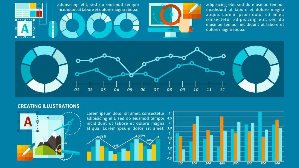
Graphics
When designing visuals for presentations ask yourself: does graphics enhance the understanding of my information? Might it offend or exclude part of the audience?
The use of graphics makes information more appealing and easier to grasp – but make sure it’s appropriate for your audience. Graphics should not be added just because you can.
Graphics include clip art, photographs, tables, charts, and graphs.
- Clip art should be appropriate, especially cartoony clip art. Photographs, maps, arrows, and diagrams are appropriate for all audiences. This is not true about clip art.
- Maintain a consistent style in artwork.
- Be aware of copyright. There is a wealth of information on the internet that presenters can use and much of it is free. However, if you take information off the internet, be aware that copyright laws apply to articles, pictures, audio files, and graphics.
- Keep visuals uncluttered. The more clip art, photos and text you have, the smaller everything needs to be.
Tables
From the point of view of the designing visuals for presentations, the tables should mainly be used as reference material. If you want to bring details to the audience, then provide them as handouts.
| Tables can be used | to provide information | and visual interest. |
|---|---|---|
| They are support | information only. | |
| If the audience needs | to have every detail, | provide it in printed form. |
- Simple is better.
- Separate vertical columns with enough space to keep entities from running together.
- If you use horizontal lines, which facilitate natural left to right reading, allow plenty of room between entries for lines.
- Avoid using grids, which box every entry and separate content.
- Highlight columns by setting entries in a bright, foreground color or with a vertical band of color behind the entries.
- Highlight key numbers with color.
Charts and graphs
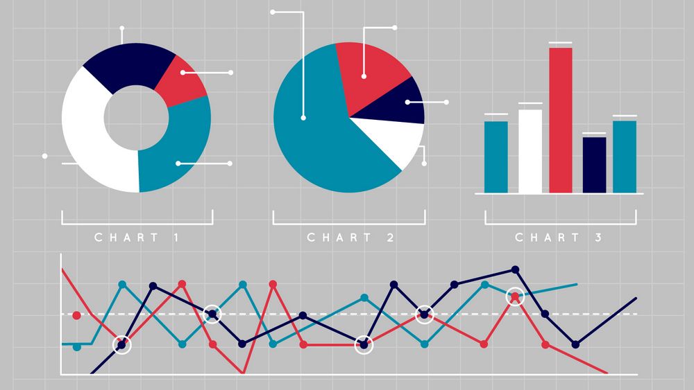
There are some basic common practices that you can adhere to when picking the type of chart to include in your presentation.
For example, pie charts are excellent when it comes to expressing proportions or percentages, while line graphs are ideal for identifying and forecasting trends. Horizontal bar charts are useful for comparing quantities and vertical line graphs are great at showing changes in quantity over time.
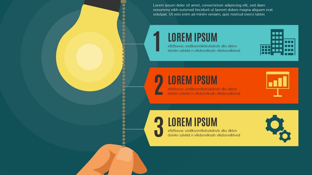
Charts and graphs are visual representations of data used to make a point quickly. They will help you to convey the information that you’re sharing in a clear, concise and engaging manner.
Facts and figures you use need to be precise, well placed, noticeable and legible. After all, it can make all the difference in producing a winning presentation, so here’s a list of tips to help you in designing your visuals for presentations:
- Charts and graphs should support what you say, not say everything for you.
- Simple is better. Information, color and design should be clean and uncluttered.
- Reduce complexity. Remove grid lines, chart frame and figure numbers.
- Keep styles and colors consistent throughout your presentation.
- Make lines thick if showing trends. Thin lines are almost invisible on the screen.
- Make the lines in bright colors. Only use yellow if it will be over a dark background.
- Have no more than five lines or sets of bars per chart, otherwise the information gets confusing and too small.
- Guide the eye to the main point of the chart with an arrow, a different color, or a box.
- Shorten numbers as much as possible. For example, use ‘19 instead of 2019.
- Use rounded numbers that are as short as possible. For example, instead of $10,400,34, show 10 or 10.4 and change the axis to thousands.
- Show only key numbers, if at all.
The data you’re showcasing should either support what you’re trying to say or at least speak for itself. If this isn’t immediately obvious, then it’s worth supporting your charts with indicative text. For example, the short subhead Sales across regions is functional but vague – if instead, you went with We’re performs the best in 2019 Q1, the viewers will immediately know what they’re looking at and draw from the graph data to support your assertion.
Making your content

Fonts
San serif fonts such as Arial and Calibri are easier to read than serif fonts like Times. Many templates use serif fonts — change them! San serif fonts don’t have the flares at the bottom and tend to be a more consistent thickness throughout the letter form that appear clearer on visuals.

- Use fonts such as Arial, Helvetica and Tahoma.
- Avoid using fonts with extreme thick and thin strokes, or thin, wimpy-looking fonts.
- Keep font size 24 points or larger. Never use fonts smaller than 18 points.
- Apply fonts to master pages for consistent size, placement and colors.
- Use no more than two fonts for your presentation. Keep in mind that fonts come in families, which are variations within one typeface design such as normal, bold, black, narrow or italics — and this counts as one font.
When presenting in a large room, the text needs to be larger than if you’re presenting in a small room.
Color
Although there is no extra cost to add color to your presentation, there are many choices that can be made. Most of the time, the colors you choose are not as important as the relationships they create. Some work well together and some don’t: use color to attract, highlight, contrast, or create a feeling or mood.

- Colors have a thermal quality. You can creatively use this property in your presentation:
- Reds, oranges, and yellows are warm colors that create a feeling that is warm, bright and cheerful.
- Cool colors such as blues and greens create feelings that are soothing, peaceful and cool.
- Green also represents growth, prosperity or envy, but doesn’t always project well.
- Choose one or two vibrant colors.
- Apply colors to your master templates.
- Use color that is appropriate for your message.
- Be careful with red which is perceived as a danger color.
- Be careful using unusual colors such as pink, purple or light green. They are not always considered appropriate.
- Avoid using red and green together. Ten percent of the male population and 5 percent of the female population are red/green color blind and can’t easily see the difference between the two.
- Use colors with high contrast for easy readability.
- Use highly saturated colors when presentations are projected on a screen.
Test your colors on the equipment you will be using. You may need to adjust colors for different media.
Highly saturated colors provide the most contrast and the easiest reading. Use white or light type on dark colored backgrounds for slides and on-screen shows.
Backgrounds
Use dark colored backgrounds for slides and on-screen shows. Light colored backgrounds work well for overheads.
- Use simple backgrounds that show off your information, not compete with it.
- Simplify the background even more if you will be using it for charts and numbers.
- High-contrast improves legibility. Use light type and artwork on a dark background for projected images.
For variety, change the background color when you introduce something you haven’t yet talked about.
Formatting your content

Create a master style
Use ready-made or create your own templates. A thoughtful PowerPoint template is a very powerful tool that helps you quickly develop slides and adhere to corporate standards.
When designing visuals for presentations choose an appropriate master style and use it consistently throughout your presentation.
- Use pre-made or create your own templates for a consistent look throughout the presentation — consistent fonts, colors and graphic style.
- Choose a master style that is appropriate for your image, your audience and your objective.
- Customize the template to suit your needs. Add logos and elements to be on all visuals.
- Simple is always better. Elaborate designs will destroy the impact of the message with the intensity of the design.
- Consistency in design will maximize the overall power of the presentation.
Page setup
Set your Page Setup to the final format you will be using – on-screen show, banner, 8½ x 11 handout, etc. This will produce the best quality output plus save you time because you will only set it up once.
Images by freepik