

Structure your complex content and add a clear user interface to make your interactive online presentation perfect. Check out our example!
Look at Wikipedia: most of the interactivity definitions are related to the interaction between users and computers through the user interface. In human language, this means the success of your future interactive online presentation will largely depend on a set of tools will allow the user to independently choose what information to view and in what order.
Those who argue that it’s better to see once are right. Therefore, in this article we’ll show you:
- a great example of interactive presentation,
- what makes presentation interactivity great and
- workable online presentation interface outline.
So let’s go!
Great Example of Interactive Online Presentation
If I have seen further it is by standing on the shoulders of Giants
Isaak Newton
Now take a look!

This is the homepage of the BBC website. Are you surprised? Don’t be shy and climb onto this giant’s shoulders. From there you will see more.
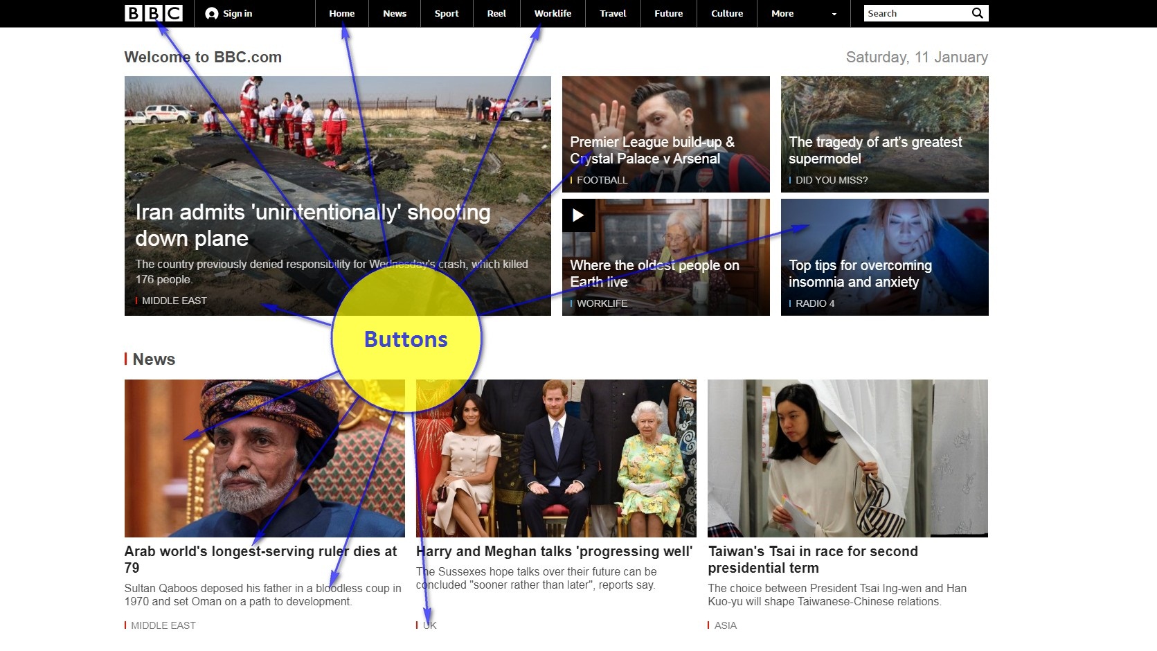
Every day the BBC makes an interactive presentation of international news. Yes, these guys don’t use presentation software, but isn’t their presentation great?
How does the BBC manage to present so much information interactively? Look carefully at the image, the answer is right in front of you!
- First, they structure the information into sections
- then each section is given a name
- and finally displays these names as hyperlinks associated with the corresponding sections: click and watch!
Think about how you can do the same with the content of your presentation. Well, if this content is a little more complicated than “How do I feed my puppy”. Then add quite a bit of presentation software and maybe you will get a good interactive presentation. Maybe…
What Makes the Presentation Interactivity Great?
We wrote “maybe …” because just structuring into logical sections and displaying their names will not make the interactivity of your presentation great. Something else will be required. Something called a convenient and intuitive user interface.
User Interface
Convenient and intuitive user interface is a set of tools which allows the viewer to independently choose the necessary topics and easily navigate through the interactive presentation.
Let’s take another look at the BBC homepage. Its interface consists of buttons with different purposes and design.
Important clarification! Hereinafter, we will talk about buttons in two senses:
- as an element of the classic web interface and
- as an interactive presentation interface element that contains a hyperlink. If you click on such an element, you will see a slide to which this hyperlink points.
Interface Elements
So, we list the important elements of the online presentation interface:
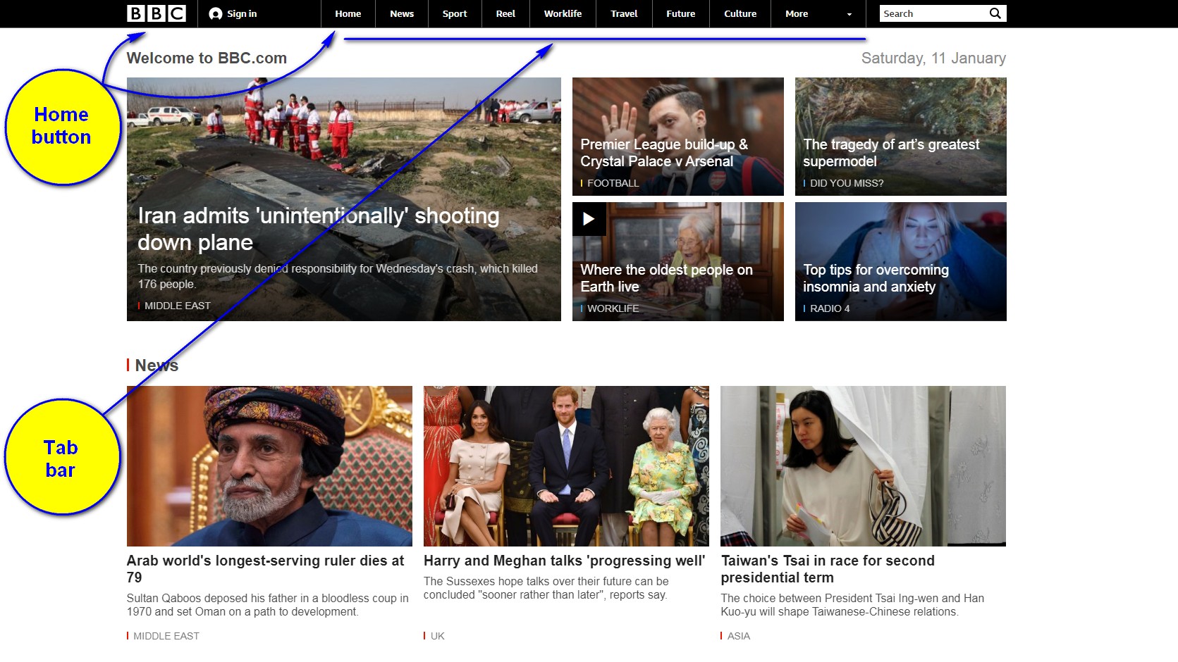
- Tab bar
The tab bar is a navigation widget consisting of many identical buttons with different titles to display the logical structure of the online presentation data.
Typically, the tab bar is located at the top or bottom of each slide. The bar does not take up much space and the viewer can easily switch to different topics of your interactive presentation using it.
Check out our article Creating Design Templates with the Slide Master to place a tab bar on each slide.
- Homepage
If your presentation is complex and the tab bar is not enough to display its logical structure, then it’s a good idea to use a special navigation slide as a homepage. Usually, the first slide of the presentation is used for these purpose.
The homepage may contain your logo, tab bar, buttons, headers, images, descriptions explaining the purpose of sections, and other interface elements to help the user quickly navigate through the presentation content.
Use the home button to quickly access the homepage.
- Home button
As a home button a logo or a house symbol is often used. Usually they are located on each page of the site. The viewer will be able to quick access to the homepage navigation tools using it.
Check out our article Creating Design Templates with the Slide Master to place a home button on each slide of an interactive presentation.
- Other buttons
The BBC homepage contains many other buttons whose design includes images, titles, descriptions, and so on.
Workable Online Presentation Interface Outline
We made an example of an interactive online presentation using the interface elements described above.
We wanted to show that a presentation with such an interface is quite functional and therefore did not care about its design. If you want to use our experience, you can easily make up for this shortcoming, right?
Since we said “to use our experience”, it is time to move from theory to practice. For MS PowerPoint proponents, we have a great article on how to create an interactive presentation using MS PowerPoint. You will find the answers to your questions in it.