Have you ever given a PowerPoint presentation and noticed that something about it just seemed a little … off?
If you’re unfamiliar with basic PowerPoint design principles, it can be difficult to create a slide show that presents your information in the best light.
Poorly designed presentations can leave an audience feeling confused, bored, and even irritated.
Review these tips on making your next PowerPoint presentation more engaging:
- Don’t read your presentation straight from the slides
- Follow the 5/5/5 rule
- Don’t forget your audience
- Choose readable colors and fonts
- Don’t overload your presentation with animations
- Use animations sparingly to enhance your presentation
Keep these tips in mind the next time you create a PowerPoint presentation— your audience will thank you.

Don’t read your presentation straight from the slides
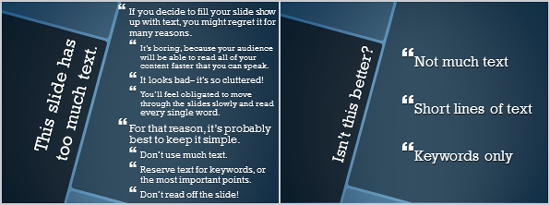
If your audience can both read and hear, it’s a waste of time for you to simply read your slides aloud.
Your audience will zone out and stop listening to what you’re saying, which means they won’t hear any extra information you include.
Instead of typing out your entire presentation, include only main ideas, keywords, and talking points in your slide show text.
Engage your audience by sharing the details out loud.
Follow the 5/5/5 rule
To keep your audience from feeling overwhelmed, you should keep the text on each slide short and to the point.

Some experts suggest using the 5/5/5 rule:
- no more than five words per line of text,
- five lines of text per slide, or
- five text-heavy slides in a row.
Don’t forget your audience
Who will be watching your PowerPoint presentation?
The same goofy effects and funny clip art
- that would entertain a classroom full of middle-school students
- might make you look unprofessional in front of business colleagues and clients.
Humor can lighten up a presentation, but
- if you use it inappropriately your audience might think you don’t know what you’re doing.
Know your audience, and tailor your presentation to their tastes and expectations.
Choose readable colors and fonts
Your text should be easy to read and pleasant to look at.
Large, simple fonts and theme colors are always your best bet.
The best fonts and colors can vary depending on your PowerPoint presentation setting.

Presenting in a large room?
- Make your text larger than usual so people in the back can read it.
Presenting with the lights on?
- Dark text on a light background is your best bet for visibility.
Don’t overload your presentation with animations
As anyone who’s sat through a presentation while every letter of every paragraph zoomed across the screen can tell you, being inundated with complicated animations and exciting slide transitions can become irritating.
Before including effects like this in your PowerPoint presentation, ask yourself:
- Would this moment in the presentation be equally strong without an added effect?
- Does it unnecessarily delay information?
If the answer to either question is yes—or even maybe—leave out the effect.
Use animations sparingly to enhance your presentation
Don’t take the last tip to mean you should avoid animations and other effects entirely.
When used sparingly, subtle effects and animations can add to your PowerPoint presentation.
For example, having bullet points appear as you address them rather than before can help keep your audience’s attention.
By GCFGlobal

