How to make your data readable, how to improve the readability of your graphs and charts: that is the questions!
Are you want to be the one:
- who uses data to tell a story in your monthly marketing reporting;
- that uses data to prove an argument;
- that makes data easy to understan;.
- your boss notices for using data smartly?
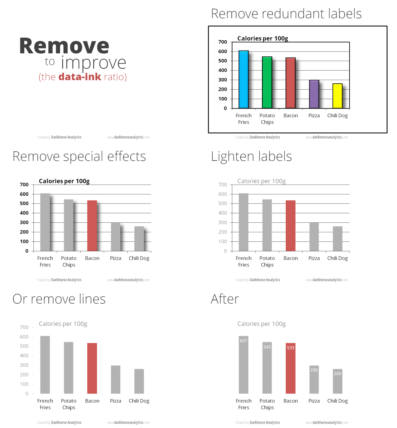
The most simple and effective way to accomplish all of those things is through the design of your graphs and charts:
- Remove Backgrounds
- Remove Duplicate Labels
- Remove Borders in Chart Elements and Background
- Reduce Colors
- Remove Special Effects Like Shading and Shadows
- Remove Bold Text
- Lighten Secondary Data Labels
- Lighten or Remove Lines
- Remove Y-Axis Labels and Label the Bars Directly
The whole point of these tips is to keep the design minimal so the data can speak for itself.
With these few simple graph design tips, you can make your data much easier to digest.
Something your boss and teammates will all appreciate.
1. Remove Backgrounds
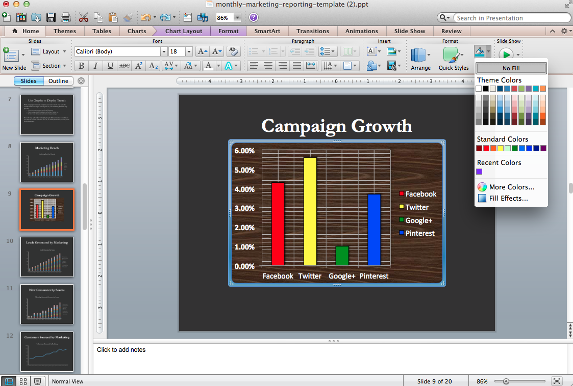
Backgrounds add distraction.
Remove the background color of your graph so it matches the slide background by clicking “No Fill” under the fill paint can icon in the top-right corner.
2. Remove Duplicate Labels
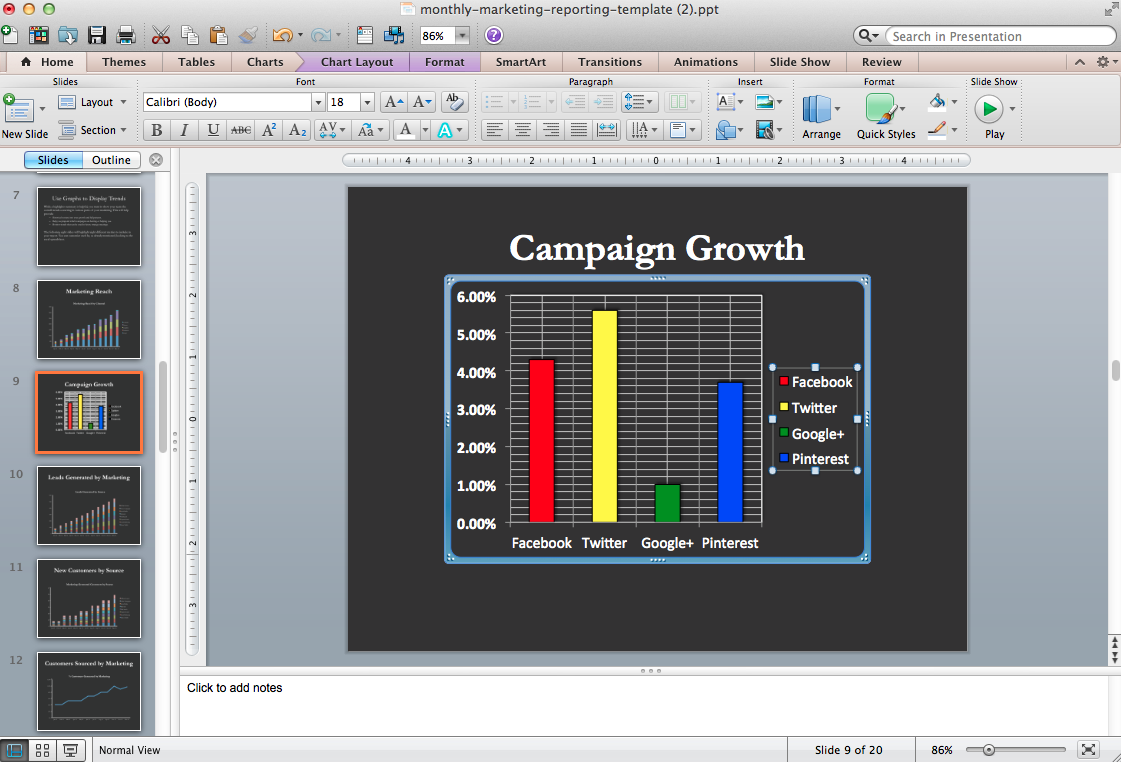
Your marketing teammates are smart — they can read what’s on the chart without you repeating yourself in the X-axis and legend.
Get rid of duplicate labels gives you more room to tell your story with what matters: the data.
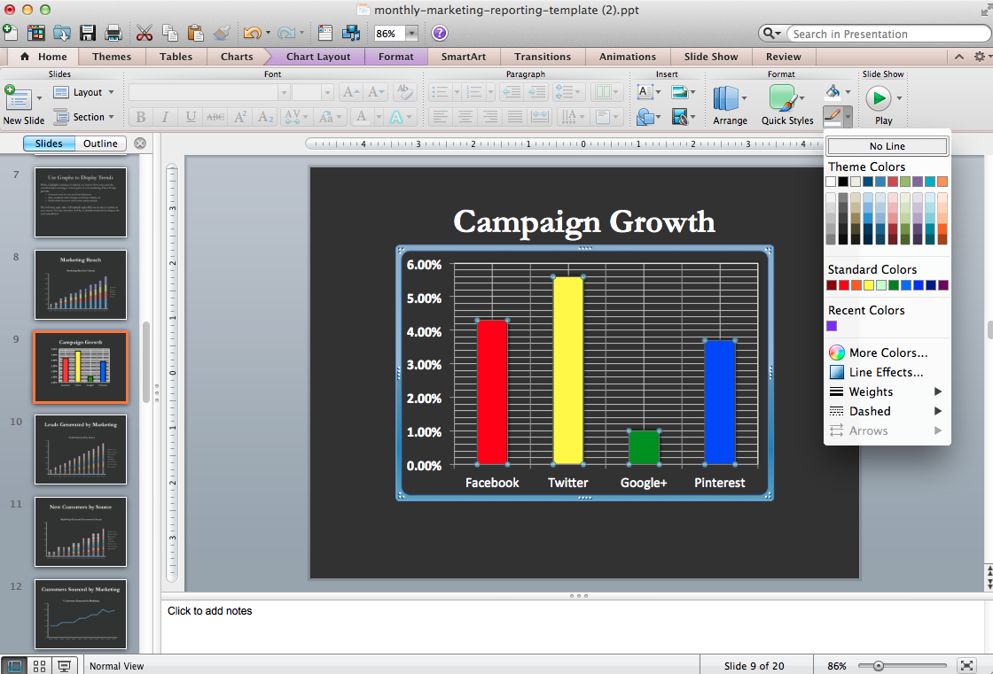
3. Remove Borders in Chart Elements and Background
Borders, like several of the design elements mentioned in the following tips, are unnecessary and distracting.
Get rid of them!
4. Reduce Colors
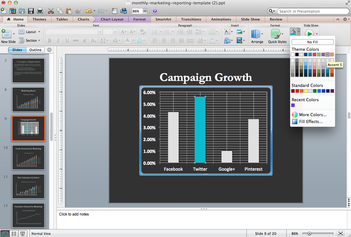
Colors are a great way to help tell your story.
For example, if the point of the slide is to show just how awesome Twitter is, you should highlight the data that speaks only to Twitter — which is why it’s the only one that has a color on the graph.
Use color to make important data pop and the unimportant data take a backseat.
5. Remove Special Effects Like Shading and Shadows
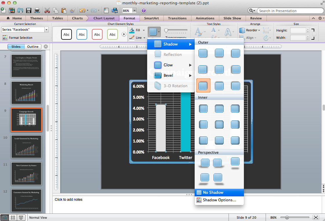
Get rid of any distractions, including shading and shadows. They add to the clutter — exactly what you’re trying to fight against.
6. Remove Bold Text
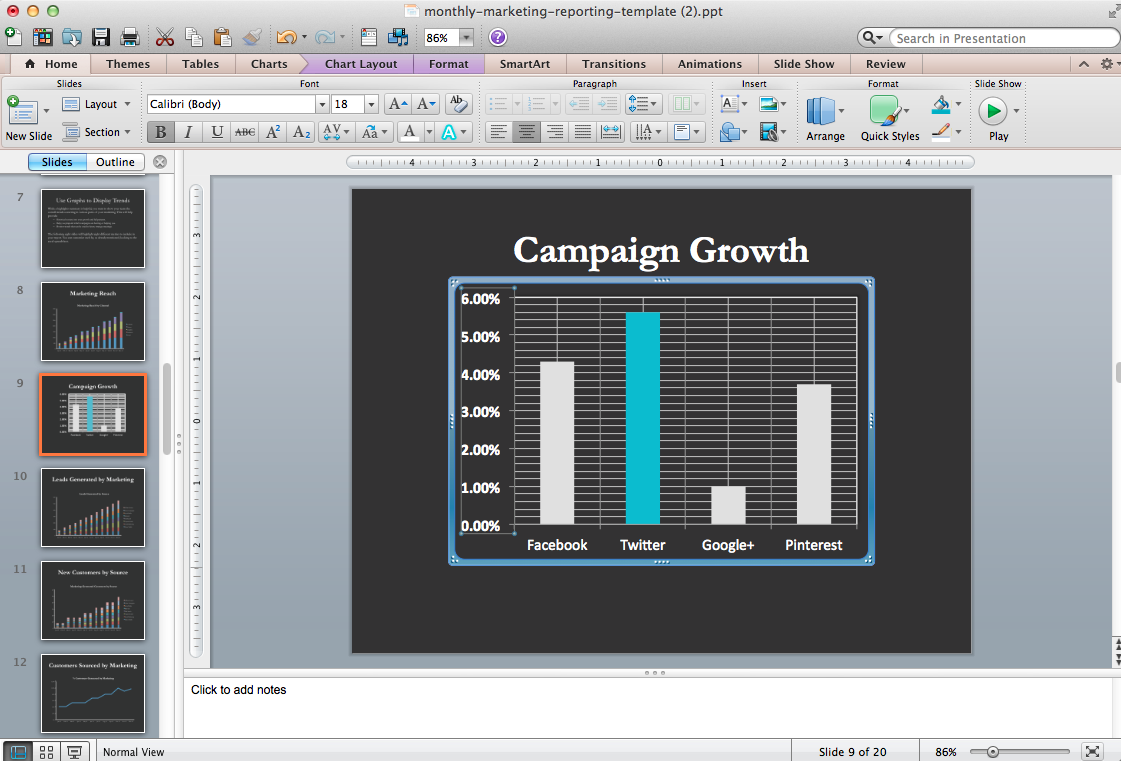
Is the bold text in the chart below really adding anything spectacular?
Nope. So un-bold, un-italicize, un-underline.
Less is more when it comes to formatting.
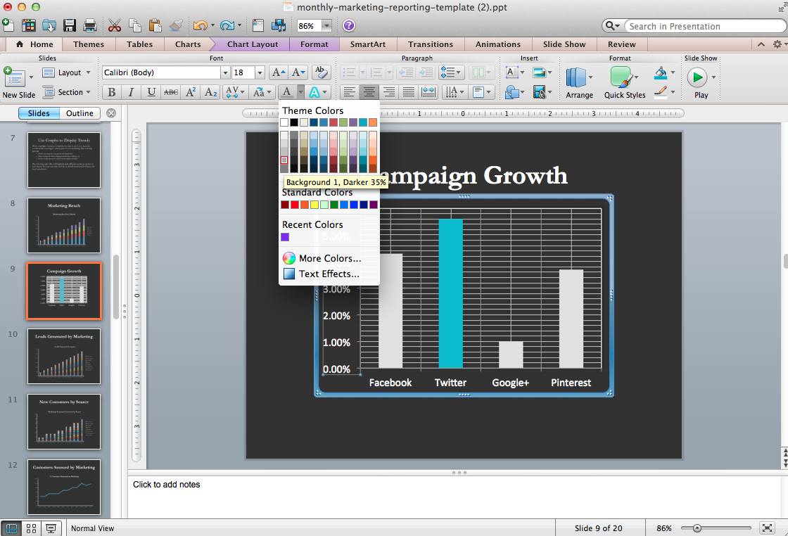
7. Lighten Secondary Data Labels
You’re trying to highlight important data when designing graphs and downplay “meh” data, won’t they?
In this example, are the Y-axis benchmarks important? Not as important as the X-axis.
Lighten the color, or skip right to step 9.
8. Lighten or Remove Lines
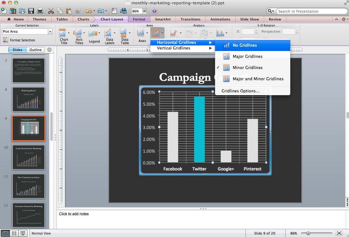
Can you really tell how far away a bar is away from the lines to determine if it’s 3.65% or 3.7%?
No way.
So, take those lines out.
9. Remove Y-Axis Labels and Label the Bars Directly
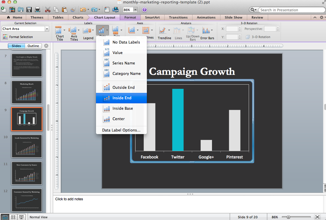
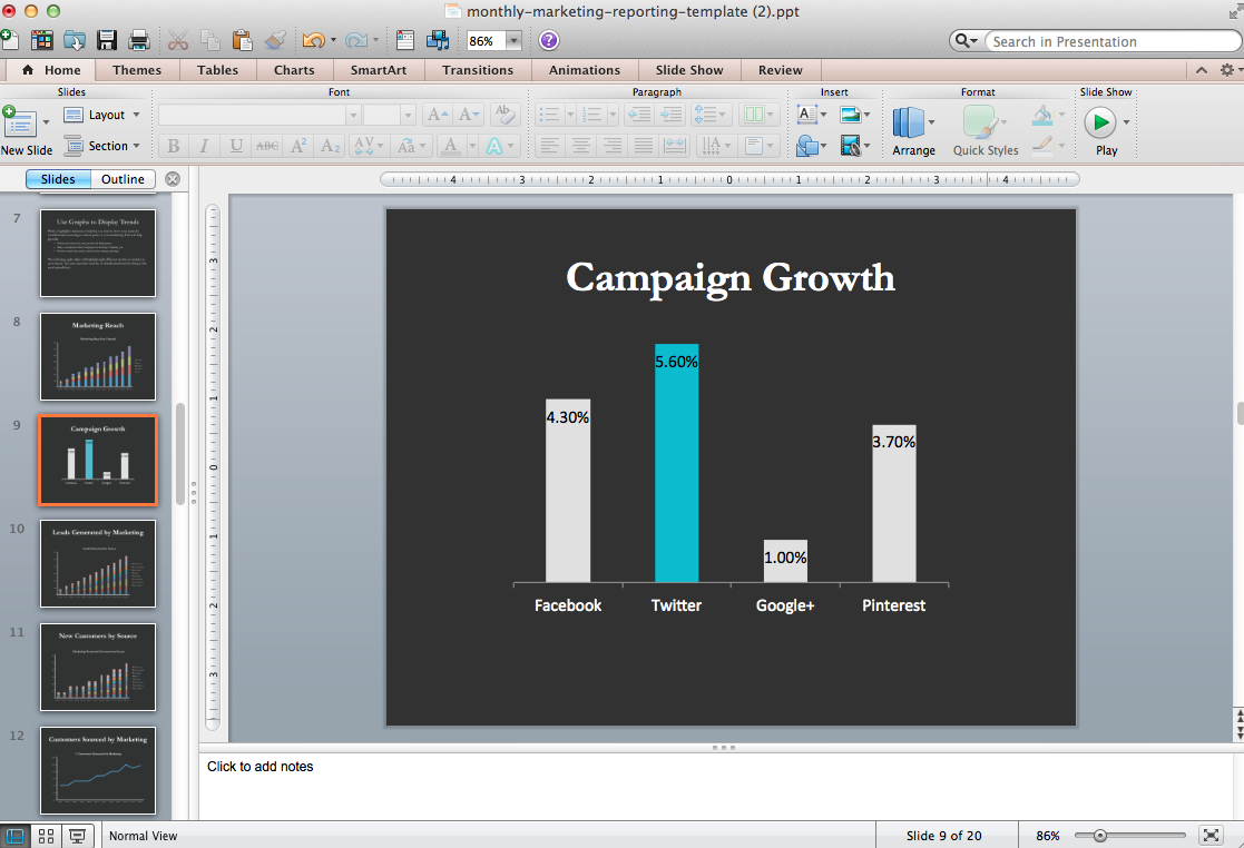
If you want to really trim fat on your graphs, take out the Y-axis completely, then label each bar individually.
That way, you can see exactly which value each bar is representing while also getting a general visual comparison of it with all the other bars.
Now…
by Ginny Mineo Image via
