
You will probably be surprised that Instructional Designers have a lot to bring to the table when it comes to your presentations. In order to understand how they can help you, you need to have a basic idea of what they do.
Here are seven tips straight from Adam Cannon, an amazing Instructional Designer on how to improve your next presentation.
1. Think SportsCenter
When you are giving a presentation, you shouldn’t give the full picture. And much like SportsCenter, you need to give only the high-level, high-profile items that will capture the attention of your audience.
It is like you are in front of the classroom writing on a whiteboard or a blackboard. You are not going to write out everything you are going to say before you say it.
Adam Cannon
Make sure you keep it simple, fresh, and easy to digest.
2. Mind The Flow
Make sure the content makes sense in the way that it is presented. Don’t use an acronym before you have introduced the separate parts of it.
Know your audience. Every audience will learn differently. If you are a programmer, the flow of how you learn content will be completely different to how a graphic designer will learn content.
3. Purpose, Purpose, Purpose
Have you the freedom to do whatever you want when you build a presentation? In a rebuttal to that idea Adam quoted Jurassic Park: «Just because you can, doesn’t mean you should».
Every text, picture, graphic, and even animation needs to have a purpose. If it doesn’t serve a specific purpose, it is considered fluff and needs to be removed.
Have a reason behind it. It doesn’t have to be anymore than a ‘Hey!’ to grab their attention or wake them up. There still should be a reason.
4. White is Alright
White space or blank space is okay in a presentation. Actually, it is preferred.
You always want to have the learner’s view in mind. And you don’t want to overwhelm them with content, even if it is relevant to the presentation and the growth of the audience.
You don’t have to left justify everything. Be creative! Use the space on the top, the right, and the bottom to change things up.
It is possible to be simple and creative. It is all in how you use what space is given to you.
5. Fonts and Colors
What looks good up close to you on a computer monitor might not look good from the back of a room.
The type of font that you choose in addition to the background color or format can create a real problem in what is comprehended. If it is a struggle to understand what is being said on screen, it doesn’t matter how important it is, you will lose the interest of your audience.
Never go below a 30-point font if you are presenting in front of a group of people.

When you are presenting in front of an audience you are presenting as much to the person up front and as to the person at the very back. Treat everybody equally and with the same respect; so use the right font and font size.
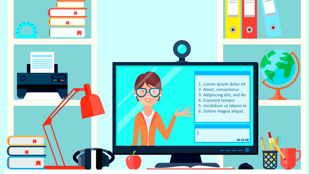
6. Bullet Rule of 6
No more than 6 bullets and no more than 6 words per bullet.
Again going back to the first point that this is a highlight rule, you don’t want to watch 10 minutes of a game in order to see the best play.
The same is true with the content you display in conjunction with the content that is given by the presenter; keep it short and sweet.
7. Slide Count Doesn’t Count
A lot of presenters get caught up and think that if they have more than 20 slides the audience is going to shut off.
This simply isn’t true, unless you have lots of content to run through on each and every slide.
The first remedy to slide count is to not show it. The audience never has to see how many slides you have.
Number two is that you can use multiple slides for a single topic or bullet point list. Meaning each slide can have one point of the 6 points in your list. But because the slides look the exact same it will just look like an object animating in instead of a slide transition.
This allows you to create complex moving objects with pictures and text fading in and out without cramming 100 animations onto one slide, thus creating presentations that are easier to edit.
And lastly, don’t shove all your content onto one slide. This will give you a longer slide count but you will get through those slides more quickly than normal.
Who are Instructional Designers?
Instructional Designers have differing perspectives than presenters on what is needed to give a good presentation, thus creating a disconnect in the interactions between Presenters and Instructional Designers.
Instructional Designers (IDs), in a nutshell, take content and create a «pedagogically sound format» ready for classroom and online situations.
In other words, they focus on
- the audience’s involvement/attention to the presentation and
- the retention of information
via graphics, layout, animations, colors, etc.
As a presenter (whether you are primarily a web presenter or not), those two points should always be close to the top on your priority list.
Instructional Designers create awesome content for a living, and presenters develop awesome content for a living. The two can and do go hand in hand. There are so many things that cross over from the eLearning world to the Presenter world, and these seven instructional design tips prove it.
The original article is here.